
Jury Me is a social media platform where users can debate in the court of popular opinion.
UX designer
iOS
Brandiing, UX/UI design, prototyping, user testing
Jury Me is a social media platform where users can debate in the court of popular opinion.
UX designer
iOS
Brandiing, UX/UI design, prototyping, user testing

In 2018, it’s pretty much common knowledge that social media platforms are something of a war zone. Facebook and Twitter feeds everywhere are littered with intense and drawn out arguments between close friends and high school acquaintances alike. What’s worse, is that more often than not, these internet battles don’t end with a clear resolution, people kind of just dig in their heels until they get tired of arguing and move on. This is where our client’s app Jury Me comes in. Jury Me is a platform in which users can present an opinion or dispute with another person to the court of popular opinion. Users can vote on each issue, providing resolution to internet squabbles.
Our client had an existing version of the application, but wanted a more refined design — he wanted the app to feel fun, but clean and professional. After exploring a few color palettes we landed on a bright blue as the primary brand color, which we paired with Avenir Next a versatile font with bold, chunky weights.

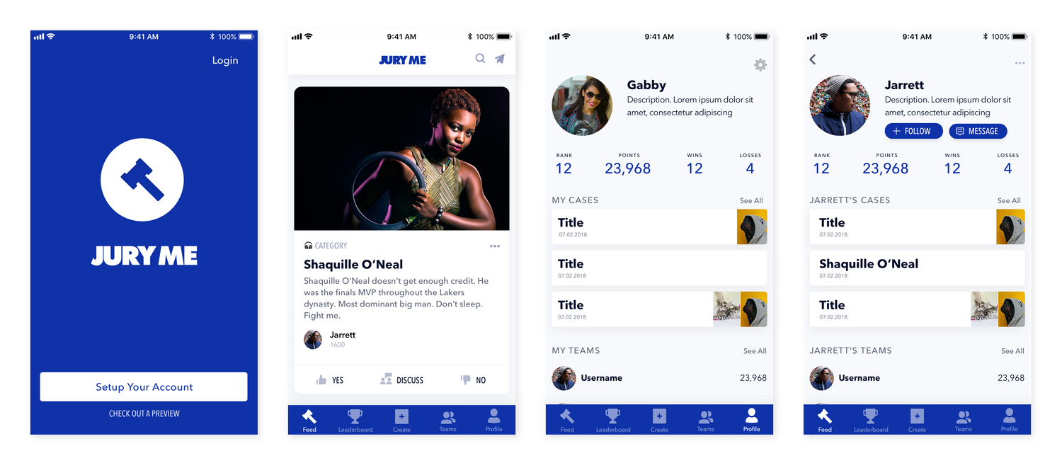
The core component of the Jury Me is the card. The card is where an argument is posed and settled. Users would need to be able to view an argument, and choose a side. The challenge here, was that our client wanted a variety of argument types — where most of the “polling” style apps that we found in our competitive and comparative analyses used a simple yes-or-no/this-or-that format originating from a single user, our client was insistent on there being a call-and-response style of argument with input from two users.
We defined 4 different types of arguments that could be made, a Text Statement (text only), a Visual Statement (a single image with text), a Challenge (text only, two users), and a Visual Challenge(images only, two users). The Challenge cards were particularly challenging to design — we were trying to cram nearly 2x as many features onto the card and we wanted to make sure to give the appearance of both arguments having equal preference while making it clear whose argument was whose and how to vote for a side.

Given the four different types of cases(aswell as two different user types) we ultimately decided to parse out every type of interaction that would occur in the process of creating a card and gave them their own screens. Our goal was to allow users to quickly select options via buttons and short forms so that the process would feel faster for users, and would allow the development team to easily implement each screen as necessary for each card type. As this was an MVP it would allow flexibility for future iterations, here are the basic flows for the 4 card styles we created:


Jury Me is currently under development by the team at Mobile App Hero.